

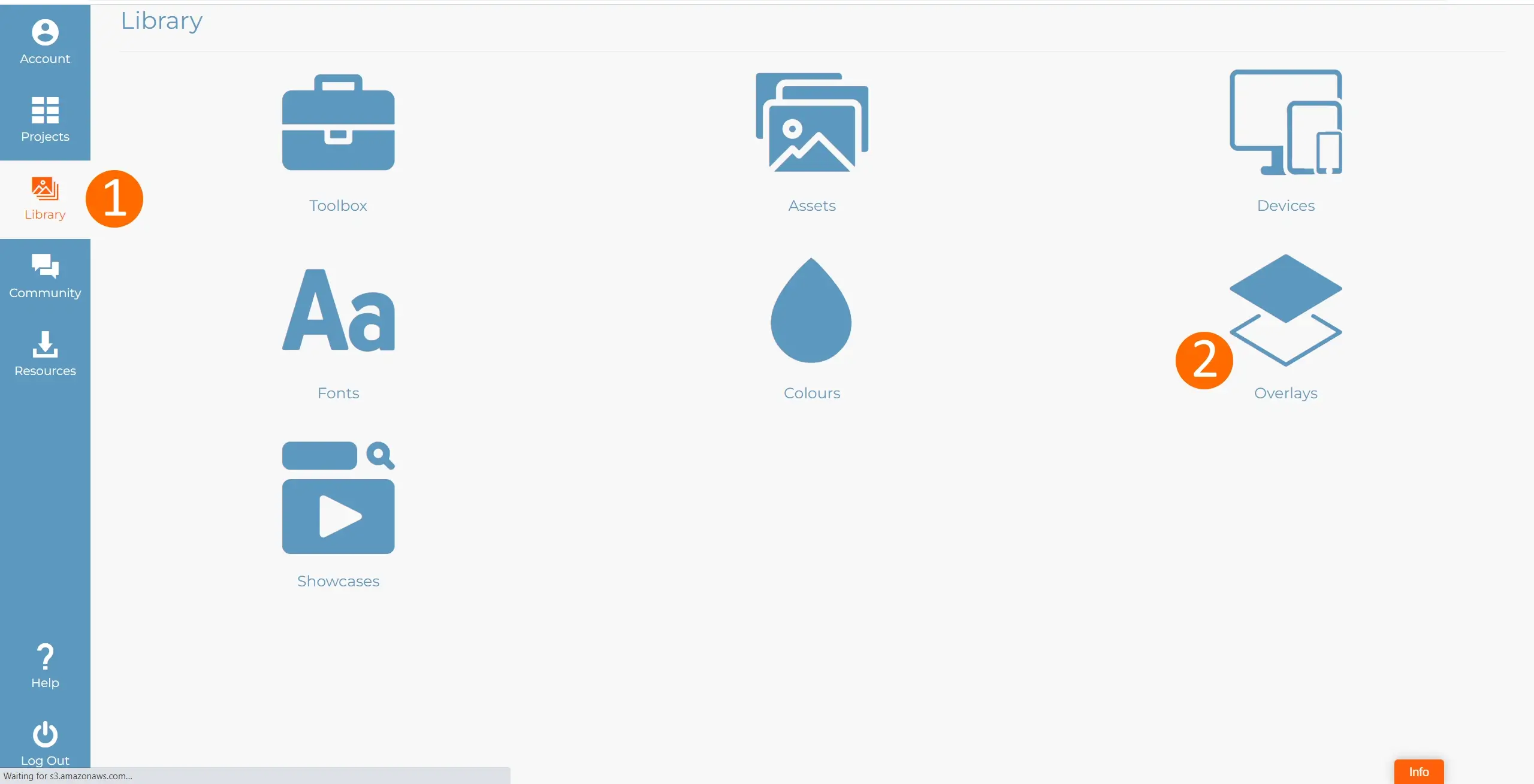
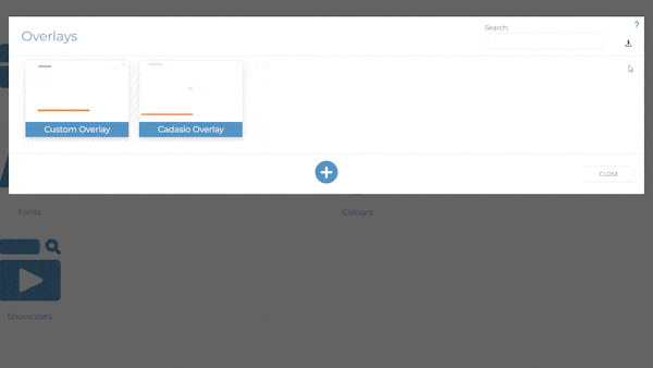
By default, all users are given a simple overlay to get started. Users with a Professional or Premium subscription are able to edit this overlay. Or you can create your own. To create a new overlay, click the add button and give it a name. When you click the edit icon you will be taken into the overlay builder.
Overlay Elements
Within the overlay builder you can add elements using the interface on the left hand side. We have several different types of elements you can add. Whenever an item is added, it appears in the center of the screen. When an item is clicked, it becomes active, and several tools become available. Double clicking an item or clicking the settings button will edit the item, opening up the items settings. Whilst some of the settings shown are generic to all item types, each different type also has unique settings. When an item is active you are able to position it by clicking and dragging. You can also resize using the bounding box handles.
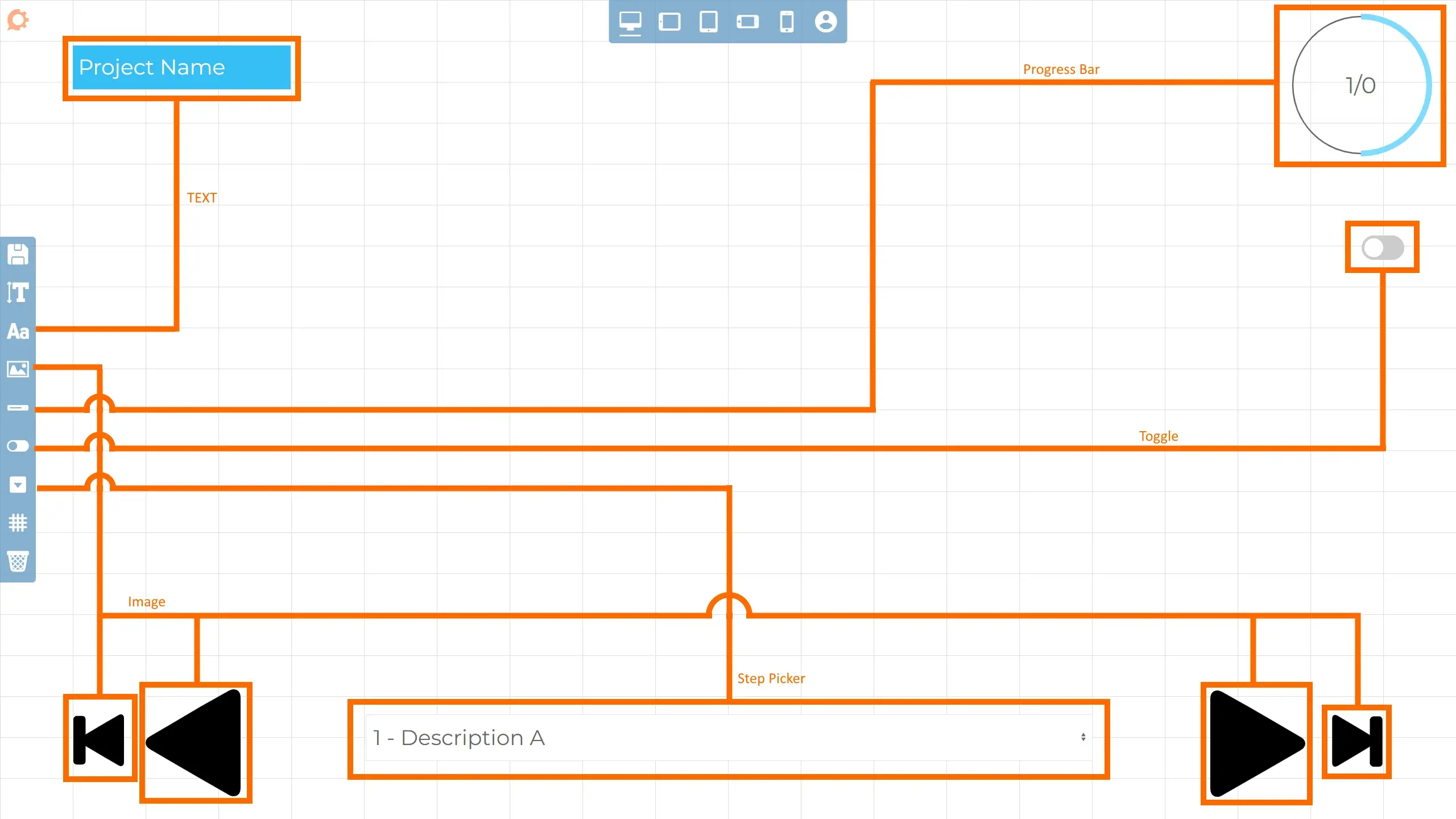
Text - Can be manually typed and meta-properties can be brought through from whichever project the overlay is being displayed on. Meta properties are very useful as information can be shown for properties such as project name, step name, step description, step number and total number of steps. Once a text box is placed, double clicking into the text will open the text settings. From here you can then format the text to match your company branding and insert meta-properties.
Images - Useful for logos and to build navigation controls. When you edit a pictures settings, either by double clicking it or clicking the cog icon you are able to choose an image from using your asset manager. Check out our asset manager blog for more information regarding this.
Progress Bar - Visually show how far the user has progressed through your presentation. You can choose from a few different styles and customise their look.
Toggle - Add a toggle to switch certain options on or off.
Step picker - A list of the steps in the project so the end user can easily jump to a specific point in the presentation.
On Click Events
All items can have on click events. These are actions that happen when the user clicks the item when viewing your Cadasio presentation. The following events are available:
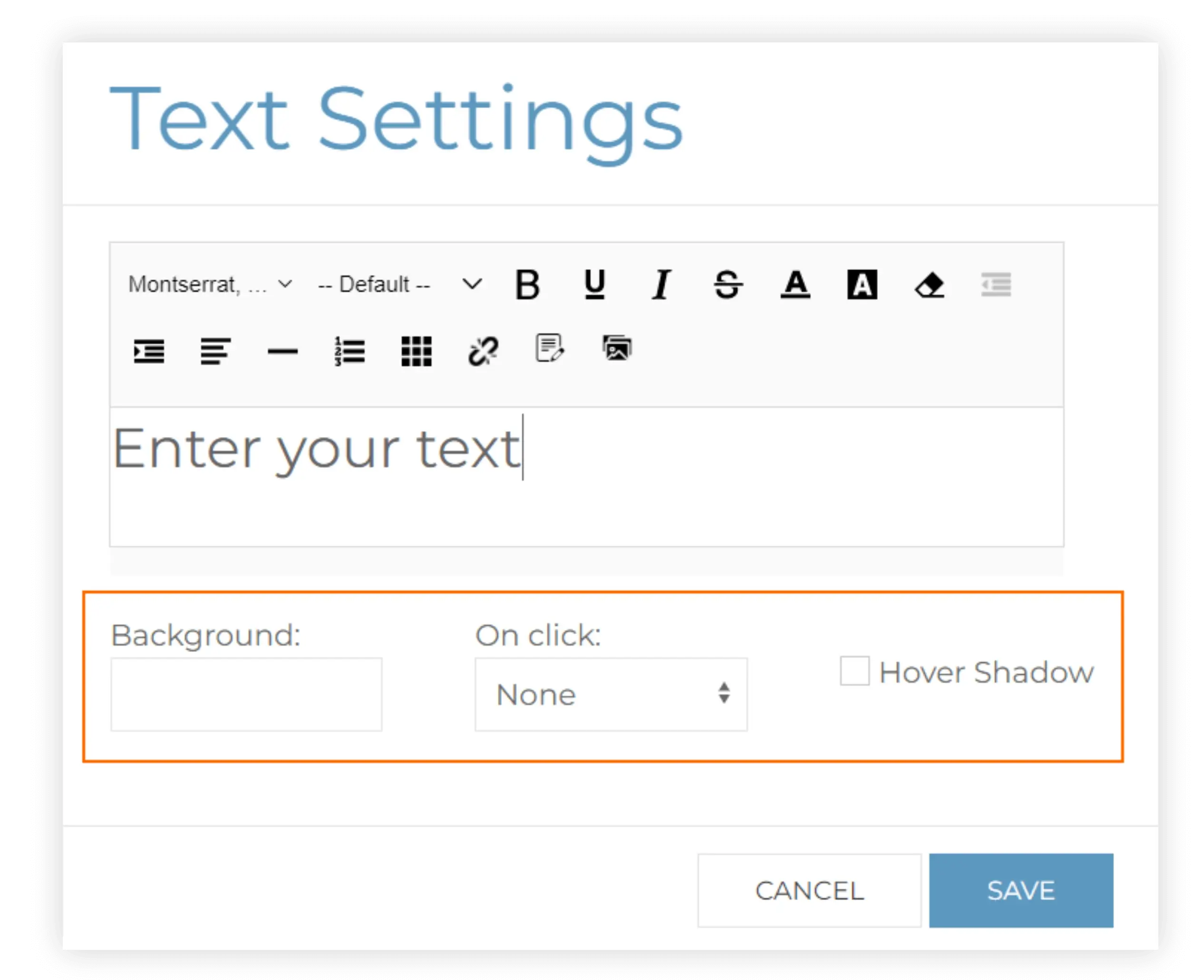
None - Nothing happens. This is the default.
Next / Previous / Start / End - Used for navigation through your project.
Reload Step - Refreshes the current step, setting the camera back to where it originally was.
Step Popup - Show the step popup if there is one.
URL - Browse to a URL.
Full Screen - Try to make the project full screen. Please note that current Apple Mobile devices current don’t support this, but their tablets do. This is an issue with Safari not keeping up with the other browsers and will hopefully be fixed in the near future.
Speak - When clicked any text in the item will be spoken using the browsers text to speech synthesis.
Hide / Show overlay - Lets the user toggle the visibility of the overlay.
Toggle Animations - Lets the user decide if animations are shown.
Toggle Speak step description - Automatically speak the steps description using the browsers text to speech synthesis.
Toggle Show Edges When Animating - Hides the edges when animating or moving the camera, this can be beneficial when viewing a large complex model on a view low powered device
Tools
When you make an item active, by clicking on it, a toolbar will appear above with several handy tools to help build your overlay.
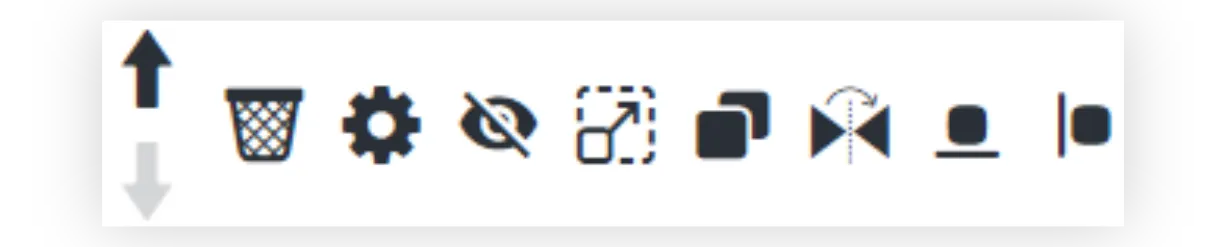
Move Up / Move Down - Use these arrows you position your items above or below existing items.
Delete - Deletes the item form the overlay, cannot be undone
Settings - Open up the widgets settings
Toggle Visibility - Sets whether this item is visible or not. This is useful when dealing with some smaller devices where certain elements may not fit on.
Duplicate - The duplicate tool is a great way to copy an element. If for example you are building a navigation, duplicating an existing button means the size will stay the same and all that is then required is to swap the image and change the onclick interaction.
Mirror - Mirror the item. Useful for images, for example when you have a next arrow and want to create a previous arrow.
Anchor - Determines where the item is positioned relative too. See below
Positioning Items
To position an item it first needs to be made active by single clicking on it. When you see the tools and bounding box appear you can then start to drag it around into position. By default, items are anchored relative to the top left. The anchor determines how an item sits on your screen when the screen size changes, and ensures it continue to look how you want on a variety of screen sizes. Typically, you will want the anchor to be set so it matches the nearest side of the screen.
The grid helps you to lay out an overlay, and elements automatically snap to the gridlines. The grid is hidden by default, but can be toggled on and off at any point in time. The grid can be customized to display the required amount of grid lines horizontally and vertically and is only visible when editing an overlay, and will not be shown when in the viewer.
Save
Whilst Cadasio does save the overlay automatically at certain points, it’s good practice to save your overlay when you have made several changes too. Use the save icon on the tools menu on the left hand side of the screen.
Devices
Because Cadasio projects can be viewed on a variety of different devices, you will want to check that it looks ok when. This is done using devices.

On the top menu, there is the option to toggle between different devices. Just like when setting devices within the designer, elements can be edited and moved and the changes will only apply to that specific device. When dealing with smaller screens, remember that you can hide elements. You can also change the size of all the text in one go using the Base Font size tool on the left.
Set Overlay
In order for an overlay to be displayed on a project, it must be set for that project. This can be done in two ways. From the details tab on a project's settings when within the dashboard. Or from within the designer. When in the designer, the overlay option can be accessed from the tools fly out menu under the viewer tab on project settings.
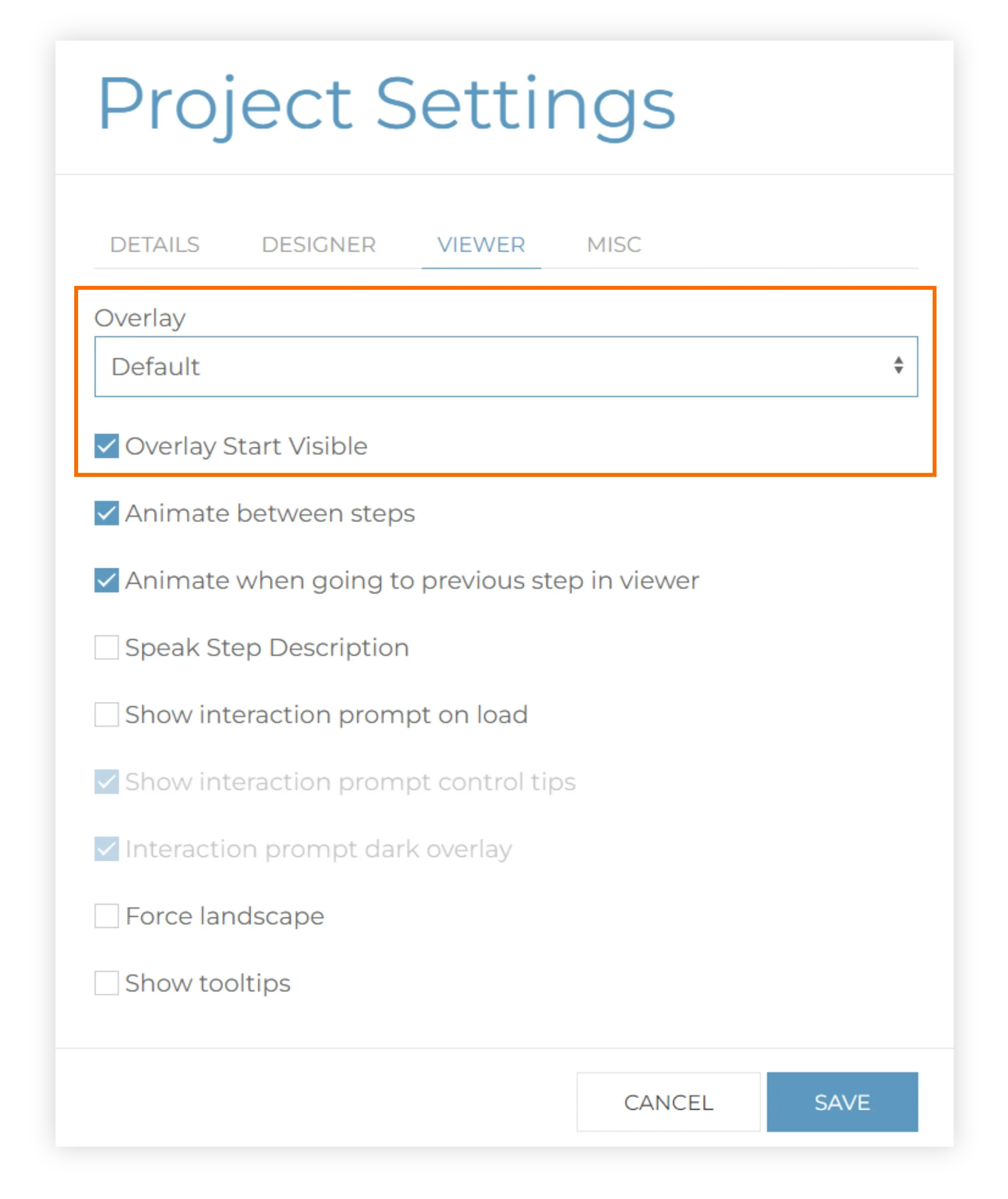
As well as being able to control which overlay the project uses, whether that overlay is automatically visible at the start of the project can also be controlled. Some of our users have bespoke landing pages for their first step and therefore hiding the overlay for these steps really helps. In addition to this, you may want to hide the overlay on specific steps within a project, not just the start. This can be controlled within a step’s settings from within the step manager.
Templates
If you are looking for inspiration or need to revert back to the default template after making changes, you can add additional templates to your library using the icon in the top right-hand corner of the overlays popup. Simply choose the template you want and import it into your library.


