

Since devices come in a range of screen sizes and orientations it’s not uncommon to need to make adjustments so that your steps continue to look great even when viewed on smaller screen sizes. This is achieved using devices.
What are devices?
Devices are a set of properties for a step that only apply when a project is viewed at a certain screen width.
The concept of devices is very similar to that of CSS breakpoints, which is used in web development. When you are creating Cadasio projects, each step has properties defining the changes that have been made, such as the camera view, an object's position and visibility or visual aspects like the background colour.
Devices allow you to create additional sets of properties that apply on top of the original step properties, overriding them, which only get used when viewed at a certain screen width.
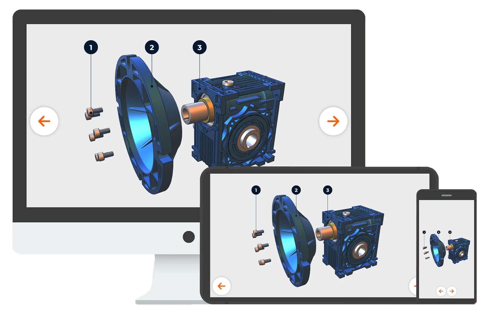
When creating a Cadasio project, you will be doing it on a computer, probably using a monitor with a standard HD resolution, but you will want to make sure it still looks good when viewed on a smaller device such as a mobile phone. This is where devices come into play.
Devices can be found by clicking the monitor icon in the top right hand corner of the designer. By default, there are two devices available, phone and tablet. When you toggle to a device, you will see a preview of how the current step will be displayed on that device. You may also find that no changes are required, it looks good just as it is.. However know that any part of the step can be modified for the device. This may be by controlling the size of text, the zoom of the camera, or the visibility of markup.
Camera
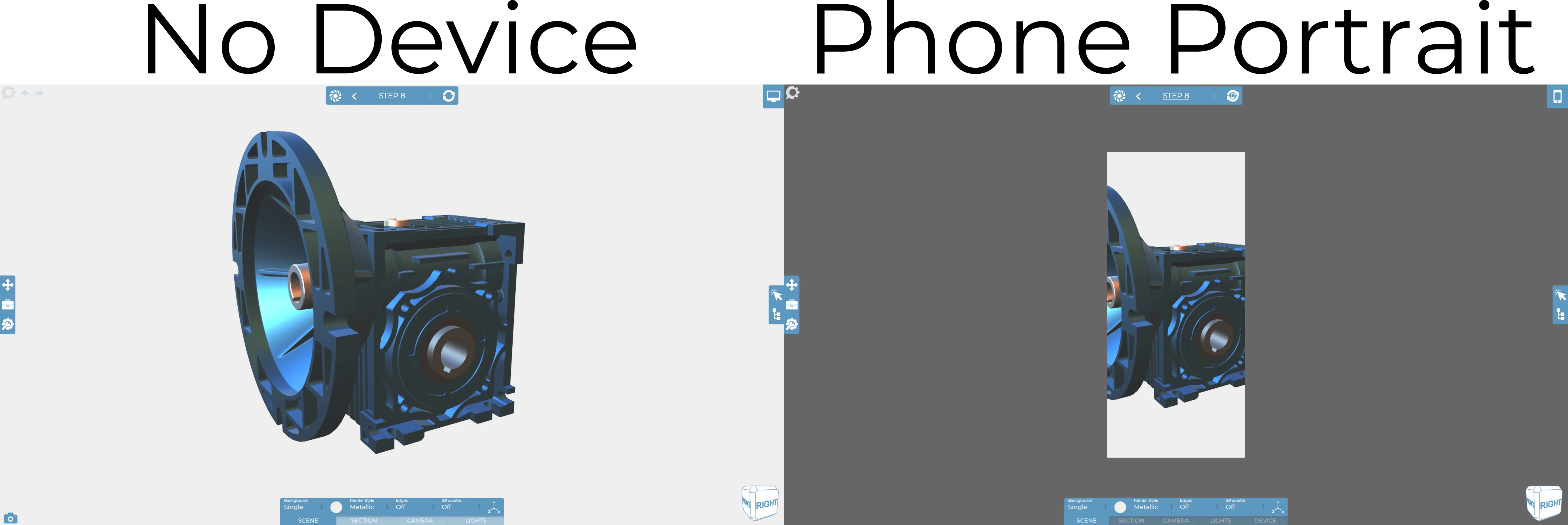
From the images above you can see that our assembly does not fit nicely within the border of a portrait phone device. Adjusting the camera is a common modification needed when setting devices, especially when looking at those in a portrait orientation. In this example a simple fix would be to zoom the camera out or do a zoom to fit so that the assembly is fully visible.
If you make any changes whilst in a device you will need to save those by clicking the update button, which you will have noticed has changed slightly. Remember when you update whilst in a device, the original properties of the step don’t get overwritten, instead, an additional set of properties are created and these are only used when a project is viewed on that device.
It's not just the camera position that can be modified in devices, we can change nearly all properties available.
Text
Labels will often need resizing so they continue to look good on smaller devices. The text size can be individually changed for each label, but a better approach is to scale the text using the device text scale slider on the device tab of the property bar. This tool uniformly scales all text which is a lot faster than having to modify each text item individually.
It’s worth pointing out that you can still use the update and propagate to affect future steps. This is really useful when changing the device scale, as generally speaking you’ll probably want the same scale in other steps. Review our updating steps video for more information about update and propagate.
Remember that device properties apply on top of the default base properties, so as a project progresses, base properties are getting overridden to accommodate the device you set up.
You may need to set up several devices to ensure your project still looks good no matter what.
Roll Down
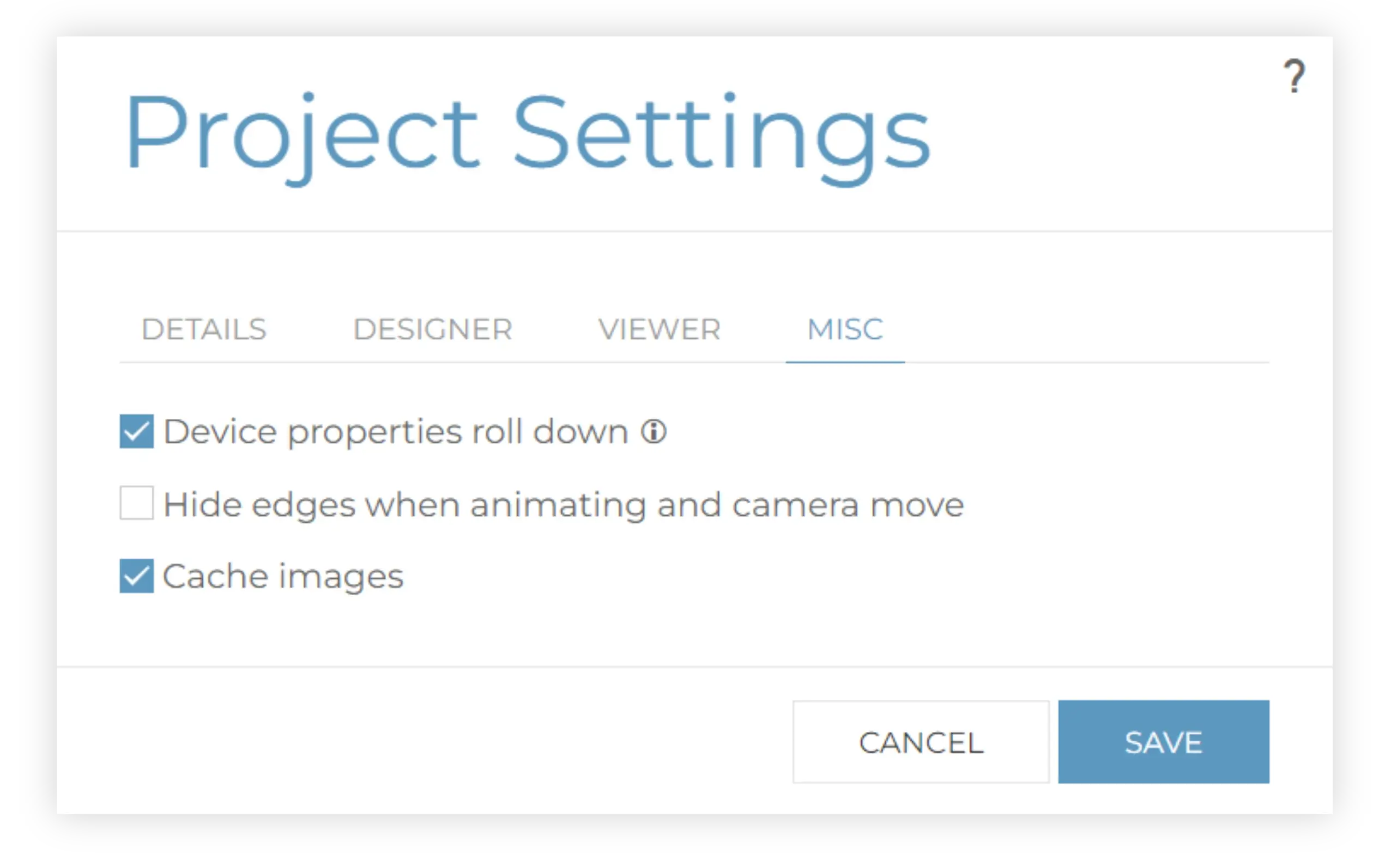
By default, devices will come into play when the screen width of the viewer matches, or if the screen size is smaller. This means that any changes you make in a device will roll down to devices with smaller screen sizes. So for example, if I change the background colour on the tablet landscape, it will roll down to the smaller screen widths associated with phones in landscape and portrait. This is a great time saver, and generally you will want to have this on however it can be disabled in project settings. When disabled, any changes you make to the device will only apply to that active device.
Force Landscape
Portrait devices often require more changes as the screen aspect ratio, orientation and size are the most different to that of a computer screen. This can be time consuming, however in a real project you may not need to worry about this. To speed up the creation of your Cadasio projects, and help ensure they look great with minimal effort, the default behaviour for new projects is to try and force the viewer to display in landscape mode. This will either force the screen to be landscape, or when that is not possible, due to the browser or operating system being used, a message asking the user to rotate the device is shown instead.

This is great as it offers a better user experience, and since the orientation and aspect ratio are similar to your monitor, it cuts down on the number of devices that need to be set and reduces the overall time required to set devices.
With force landscape on, you will also notice that the number of devices listed is reduced. If you don’t like this behaviour, simply disable the ‘force landscape’ option found on the viewer tab of the project settings.
Additional Tips
Hopefully given the above information you now understand the concept of devices and are confident setting them up. As you work with them we have a few additional tips to help.
Set Devices Last
Probably the most important tip is to always leave devices until the end. Finish your project in default mode and then look at the devices. Start at the first step, activate the largest device, then work you way through your steps whilst in the device updating them where necessary. Once you get to the end, start again on a smaller device.
Remember that on some projects, your steps may look great as is and setting up devices may not even be needed
Zoom to fit camera
Often it may just be the camera that needs changing to fit better on smaller screens. When this is the case, the zoom to fit camera tool can be run on several steps at once. This is prompted from the steps manager. This will activate each selected step and run the zoom to fit command then update the step for the active device. Remember that whilst this could be a huge time saver, if those steps had text or labels you may want to go and review that they look how you want and are positioned correctly.
Delete device properties
If you make any changes whilst in a device, and then decide you want to reset them, this can be done using the delete device properties tools on the device tab of the property bar. You can delete all current step properties for the active device, future properties for the active device, and all properties for the active device.
If you need to delete properties for a specific object, select the object and the same set of tools is also available on the general tab.
Custom devices
There may be situations when custom devices are required, such as when embedding the Cadasio viewer on a website, or if you intend to view on a non standard or specific screen width. When needed, you can define your own device, with their own unique size and these can be activated and worked on just like any other device. The height is mainly used for the preview within the designer, but also as a second way to match if you happen to create multiple devices with the same screen width.
Full Screen
When publishing your projects online, Cadasio can try and force it to be displayed in full screen, which will best match the device preview seen in the cadasio designer. This is supported on Android devices and iPads.
Force Device
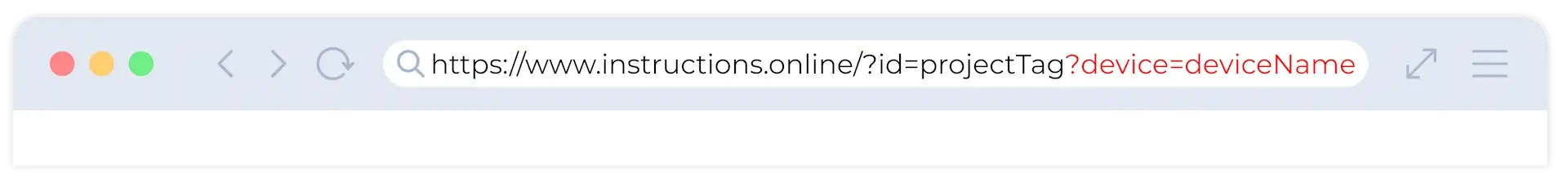
You are able to force a particular device to be used no matter the screen width if you amend your viewer URL to include ?device=deviceName” This is another useful trick when embedding projects within a website.


