

In this latest update we have added Overlays, enhanced options for fonts and colours, and improved the way devices are handled. Some of these developments have resulted in a change of behaviour compared to previous versions of Cadasio, so make sure to take the time to read this article or watch the updates video for full details.
Devices
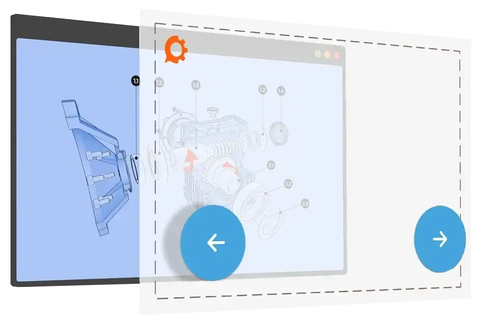
Devices are used to control how your steps look on different screen sizes. This latest release changes the way devices behave and how they are configured.
In previous releases, Cadasio used the screen’s aspect ratio to determine which device properties should be used. Whilst this worked, it was not ideal due to the amount of variables across different device manufacturers, so to improve this, we have changed the behaviour to improve the experience.
The width of the screen now determines which device properties are used. This should be familiar to anyone that uses HTML & CSS as it is comparable to breakpoints. Whilst we give you the most common breakpoints for each device such as landscape tablets, you can still create your own devices if you have a specific screen size you need to cater for.
Rolldown
We found that in most cases, when properties are changed on a larger device, such as a landscape tablet, those changes also need to be reflected on smaller devices too. Previously this had to be done manually for each device, including their two orientations, but with our latest update, any changes you make whilst in a device will now roll down to smaller screen sizes. This will make setting devices a lot quicker.
As this behaviour is different to previous versions of Cadasio, the option to roll device properties down will only be enabled by default on newly created projects. You can turn this new behaviour on or off for any project by going into the projects settings.
Force Landscape By Default
In a previous update, we added the ability to try and force the viewer to display a project in landscape. With this option enabled, Cadasio either forces the screen to be landscape, or if that is not possible, due to the browser or operating system blocking it, a message appears asking the user to rotate their device. This has proven to be a popular option as it removes the need to set portrait device orientations so this is now enabled by default for all new projects.
Markup
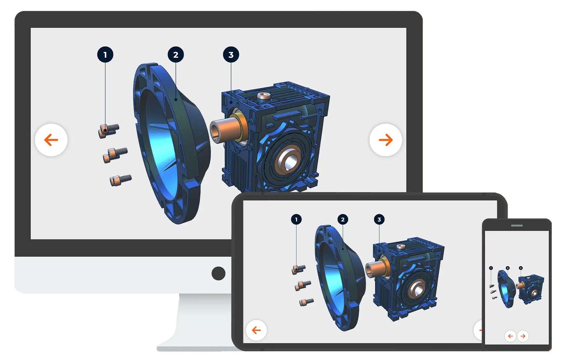
Previously the size of markup was defined as a percentage of the screen width. This was good for some items, such as pictures, but it meant that text became rather small on certain devices, especially when viewed in portrait. To mitigate this, you can now define items by pixel size rather than just percentage. This behaviour is perfect for text, balloons and labels, and the default toolbox has been updated to work in this way too.
For those who have already customised their toolbox, nothing will be automatically updated, but if you like this new behaviour you can either update your toolbox components, or simply get the default toolbox again. If you are using an old toolbox item then depending on its age you may be asked if you want to update it automatically.
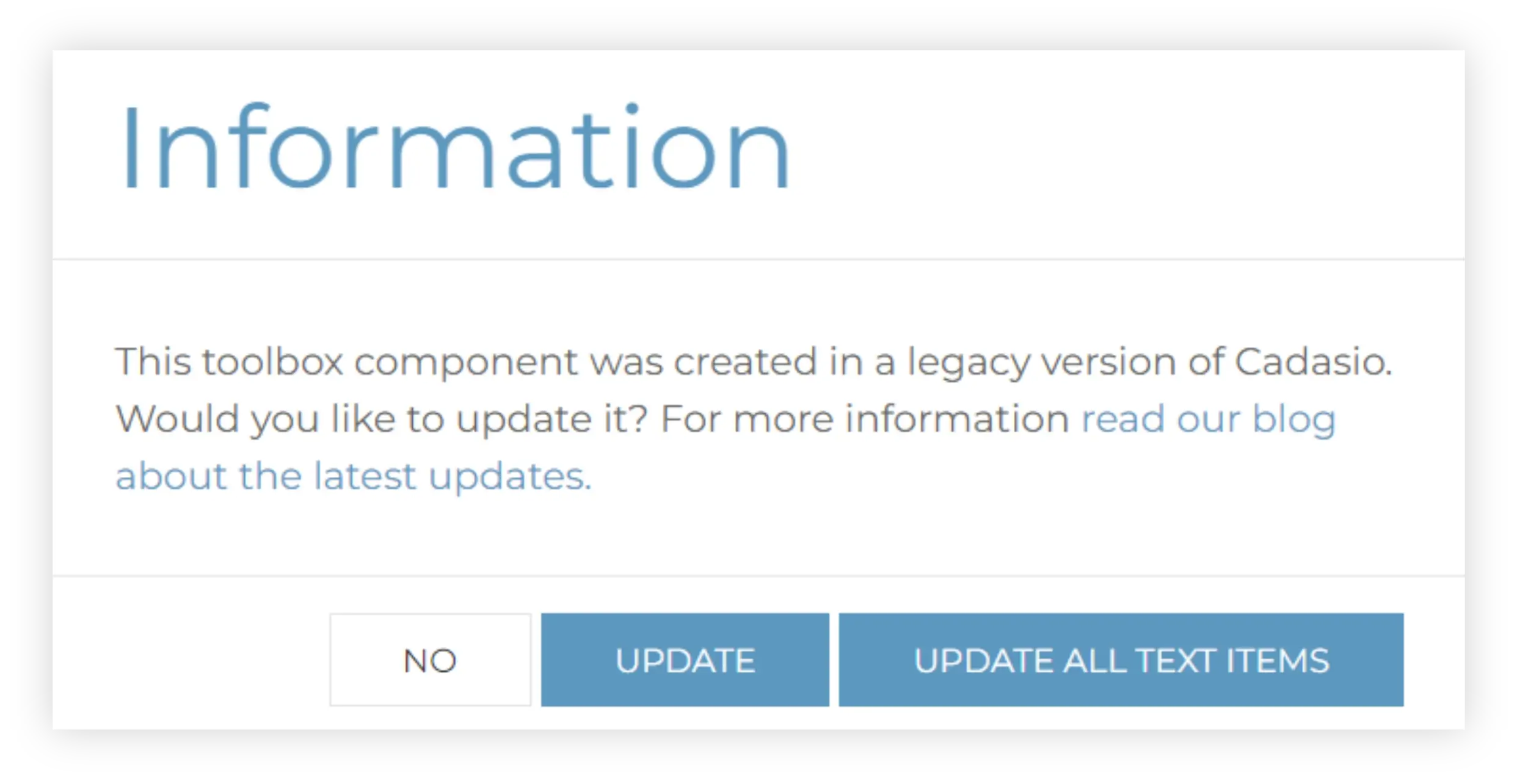
If you are unsure then click no, you can always update them yourself manually later, however we generally recommend that you have elements that contain text to be defined using pixels so that they naturally look better on devices with minimal effort. If you want to start fresh, then don’t forget you can always import the default toolbox again, so you know you have got the recommend setup.
We have a separate blog and video detailing the differences between pixel and percentages for item sizing that is well worth a read.
Device Scale
To complement the changes in markup sizing, we have also introduced a device scale. With this setting you can very quickly modify the size of your text markup with minimal effort. Device scale is a scene property which can change between steps. For consistency throughout your project, make sure to use the update and propagate tool.
Zoom To Fit
Another top enhancement request from customers was the ability to carry out a zoom to fit on multiple steps at once. Found in the steps manager you can now pick the steps you want to update and then Cadasio will activate each in turn and do a zoom to fit. This is a great time saver when you need the scene to fit across multiple steps on different devices.
Delete Device Properties
You can now delete properties for a particular device. You can delete the current steps device properties, future properties, or all properties. This is a useful feature if you need to “reset” a step to how it would have looked before you made any changes in the active device.
Device Summary
With these new changes, devices are now a lot easier to manage and much simpler to set up. For more information, including detailed examples of exactly how devices work, take a look at our devices video and blog.
Overlays
Overlays have consistently been one of our most requested enhancements, so we are pleased to announce that these are now available with this latest update..
Overlays are reusable templates that can be applied to any project. These templates include common items that you would display on your projects such as text, images, navigation, and meta-data, as well as some other useful elements too.
Overlay Builder
Found on the library tab of the dashboard you can now view and create overlays. When you create a new, or edit an existing overlay, you will be taken to the overlay builder where you can begin designing it.
There are a number of different types of items you can add to an overlay to make it your own including;
- Text - Fully customisable and can be populated with meta data such as the step description and project name.
- Images -Useful for displaying logos or building navigation controls, such as next and previous buttons.
- A Progress Bar - Visually shows how far the user has progressed through the presentation.
- Toggles - Allow certain options to be turned on or off.
- Step picker - Displays a list of steps from the project so the end user can easily jump to a specific point in the presentation.
Onclick Events
For any of the items added in the Overlay builder you can add an onclick events such as navigation controls, or even linking to a specific URL.
Default Overlay
Previously, by default, a Cadasio project would have a navigation bar at the bottom of the screen, which gave the viewer controls to step through your project. This has been replaced with a more modern and sleek default Overlay. Users on Professional or Premium Cadasio can edit this default overlay to customise it to look exactly how they want. Premium users also get the added bonus of additional pre-created templates too.
Check out our Overlays blog article and video for more information.
Colours
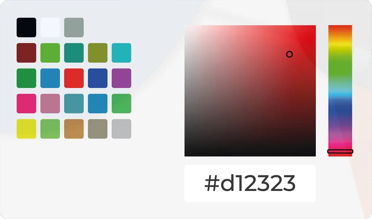
To help keep your projects consistent and maintain your company branding we’ve added a customisable colour palette that appears anywhere you can choose a colour within the designer.
Check out our colours blog and video for more information.
Font Sizing
Previously you only had a limited, predefined set of font sizes available when adding markup to your presentations. You can now define custom font sizes to use throughout your projects which can be easily scaled at project level.
Head over to our separate blog article to learn how to set up your own font sizes.
As well as all the large changes mentioned above, we’ve also implemented a variety of fixes and made enhancements to improve the overall experience with Cadasio. We are driven by your suggestions, so if there’s any features you feel are missing, or you have ideas on how to improve existing functionality we would love to hear from you. Contact us through our website or through the form within the help area of the dashboard.


